~ Stone Junction rebrands to reflect evolving identity ~
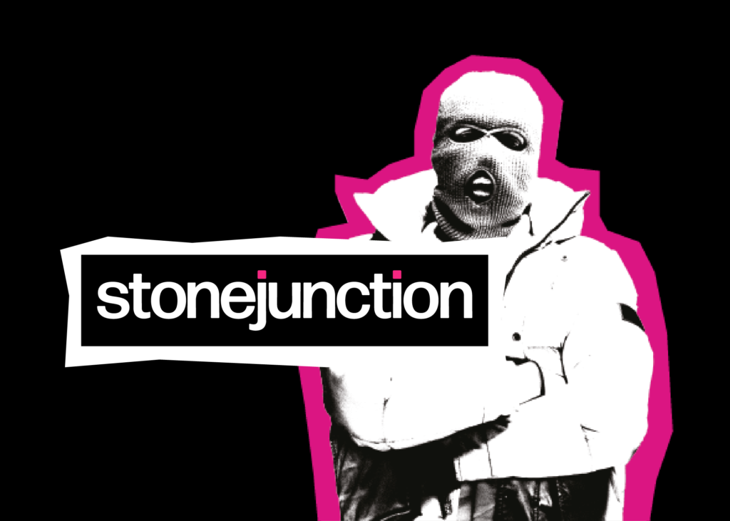
Technical, technology and science PR agency Stone Junction, has rebranded to signal a new phase of the company’s development. The iconoclastic and irreverent new visual style is the company’s first rebrand since 2014.
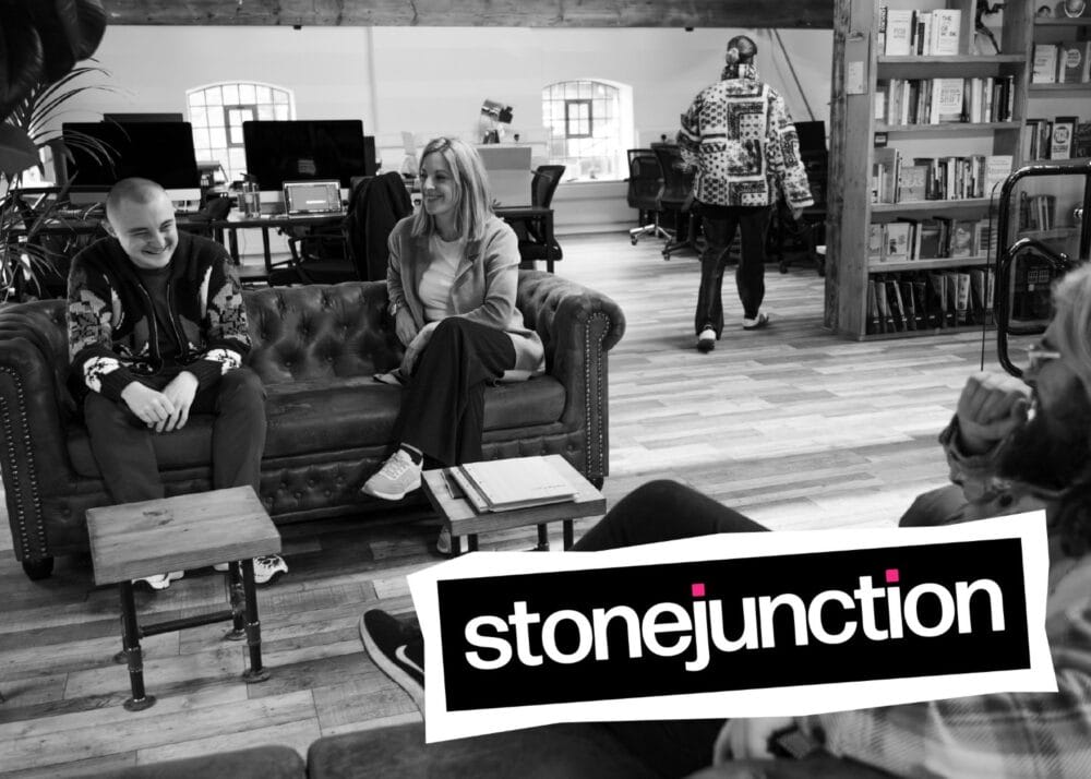
The overhaul of Stone Junction’s aesthetic is part of a wider infrastructural upgrade which is set to see the company to expand rapidly. A series of new hires, a move to a larger office and expansion of the PR, communications and marketing services offered, all position the agency as ready to grow strongly in the coming months and years.
“The PR industry has changed dramatically in the last five years and it’s important that Stone Junction adapts with that change,” explained Richard Stone, managing director of Stone Junction. “In a funny way, while our clients and friends across the PR world have gotten younger on average, we’ve matured as an agency.
“I wanted to make sure that, amid all the exciting upheaval, change and growth, we retained the witty, anti-establishment, and iconoclastic identity that Stone Junction has always had. We’ve grown organically, without any external investment, and we’re proud to be a company with an entrepreneurial, positive and DIY aesthetic that pulls itself up by its bootstraps.”

Branding, of which visual identity is a crucial part, is central to a company’s key values and the way it chooses to communicate those values. The striking blazes of colour in the new Stone Junction visual style stand out from the deep, broody black canvas and convey the company’s provocative and challenging approach to capturing attention for its clients.
“I think the punk influences for this design scheme are clear. We want it to excite people and make them wonder about us,” explained Kelly Doble, senior designer at Stone Junction. “The Sex Pistols, Vivienne Westwood, and The Clash’s first sets of punk ideals might be 45 years old, but they still stir up rebellious feeling.
“Having this design capability in-house means that we’ve been able to keep the root of our brand identity while giving the company a new face. Although it seems like a big change, this is a natural progression from the agency that we have been into the one that we’re becoming.”
To see more of the rebranded identity and to find out about how Stone Junction’s rebrand design services can help your company to update its image, visit the new website at wechangeminds.com.


