The engine has been conceived and perceived not only as a generator of power but also as a brand ambassador, designed as a “means of communication” of the founding values and passions of the brand itself.
While a focus on the aesthetics of an engine is not common within the traditional powertrain industry, FPT Industrial, always seeking to innovate, has collaborated with the Turin campus of IED (European Institute of Design), the prestigious school, founded in 1966, operating in the field of training and research in the disciplines of Design, Fashion, Visual Arts and Communication, to create cutting-edge powertrain engines with a unique, artistic design that is balanced with function and efficiency.
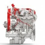
The partnership between FPT Industrial and IED is a first in the industry. This collaboration aims at giving immediate visibility to the design and production quality of the brand’s engines, to the humanization process that sees the product become more and more user-friendly, and to the return to the color red for FPT as a distinctive symbol of power and passion for performance. Through their projects, the students have successfully created style and creativity exercises that convey the products’ excellence and the brand’s intrinsic uniqueness.
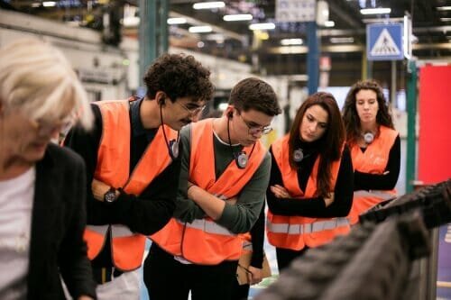
Starting from the end of October 2019, four teams, each made up of product, transportation, and graphic design students, supported by a company tutor for each group, have been involved in a tight schedule of factory visits and intense talks with the various company managers, aimed at creating first-hand knowledge of the world of engine production and stimulating participants to interpret this world through different eyes and directing their creativity to look at new rules.
The Texture Team was chosen to create a series of patterns to be applied to the body of the powertrains to make them immediately recognizable, even if the engines themselves are repainted by customers. This resulted in proposals making creative use of FPT’s logos with themes that ranged from the animal world to that of the transmission of sound in space.
The Label Team, on the other hand, decided to characterize the engines of the brand by adopting a sustainable solution in all respects, including from a cost point of view, intervening on those elements – such as the oil dipstick – which are always visible and take on a wider meaning but are also more pleasing to the eye if personalized with the brand logo. The team has also created a recycled plastic label that describes some of the engine’s characteristics and offers space for multimedia content.
The Shape Team has undertaken the difficult challenge of making the engines exhibited at trade fairs not only unique, distinctive, and immediately recognizable, but also comparable to actual contemporary works of art. The resulting proposal, which plans to involve the participation of artists such as Cao Fei, a digital art guru, has given rise to a completely new way of presenting products and their performance by communicating actively with the public and with the exhibition spaces.
A note of merit also goes to the Color Team, which suggested decorating some key parts of the engine with a heat-sensitive paint that, as the temperature increases, reveals previously invisible details and content, giving a strong external meaning to what is happening inside the engine.
These Teams shared their ideas in the presence of FPT Industrial and the CNH Industrial Design Center senior management.

